 Subscribe

 (Source)
Can you believe it came from this humble origin?
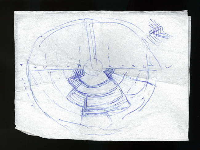
I started brainstorming my entry in the airport, appropriately enough. The only tools I had available were the proverbial napkin and a pen, and I started sketching while waiting for my flight.Airport napkins? I swear, the universe was conceived on a napkin. The ROM in Toronto was also born the same way! Coincidence? I think not.

2 Response to Inception map: everything's better with infographic
A lot of great things are born out of doodles on napkins and other such materials. I'd say most of any great designs are born that way..
This one though, not so much. I haven't seen a single Inception infographic that made it any easier or clearer to understand the structure of the film. It's actually much easier to get it while watching the film, and personally I never found it to be all that complicated to follow to begin with.
But ... it's so pretty! And the sliding part of the graph was particularly clever?
Post a Comment